

Figma Plugin
The Formhaus Figma plugin renders form mockups from form definitions, with a built-in Material 3 or iOS-like kit, or with your own design system components.
Install
- Clone the repo and install dependencies
- Build the plugin
pnpm install
pnpm --filter @formhaus/figma build- In Figma, go to Plugins > Development > Import plugin from manifest
- Select
packages/figma/manifest.json - The plugin appears under Plugins > Development > Formhaus
The build bundles the plugin code and its UI into packages/figma/dist.
Usage
- Open a Figma file and run the plugin (Plugins > Formhaus).
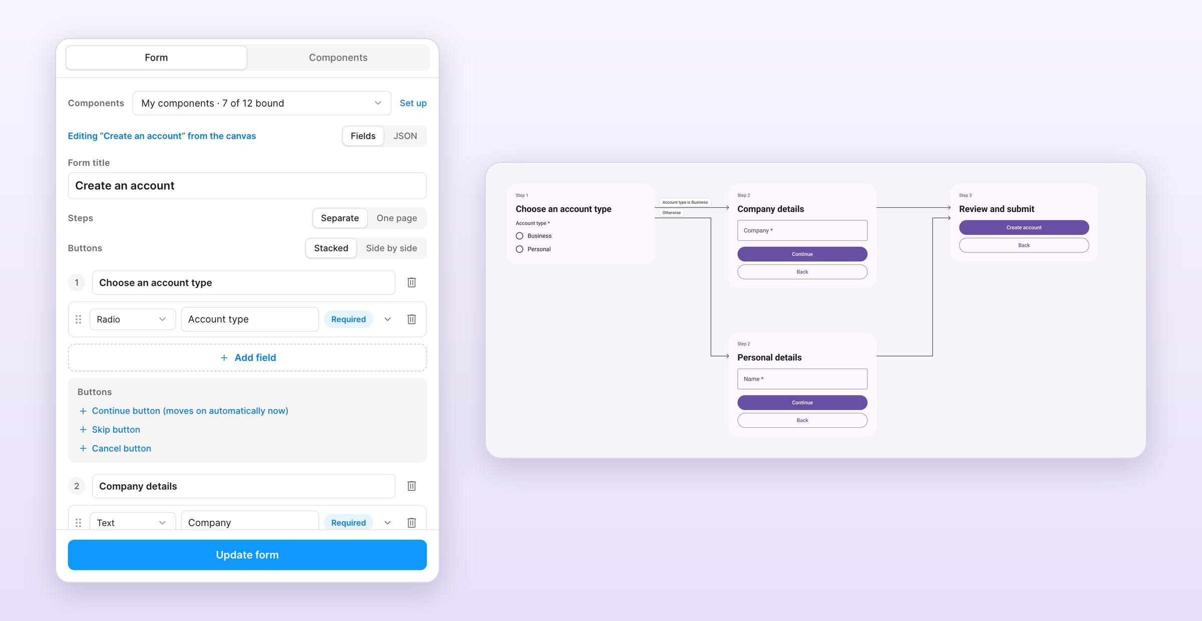
- On the Form tab, pick the components to render with: a built-in kit or My components.
- Build the form in Fields: set the title and submit label, add fields, mark them required, and open a field's details for its placeholder, helper text, key and options. Drag fields by the handle to reorder them, or split the form into steps. JSON shows the same definition as
@formhaus/coreJSON. - Click Generate form.
Each step has a Buttons block under its fields:
- Continue or Submit renders as the primary button.
- Back renders as a secondary button from the second step on.
- Skip and Cancel render as text buttons. Cancel shows on every step.
Labels can be changed per step, and Continue and Back can be removed. Buttons at the top switches between stacked buttons and buttons side by side. Side by side puts Back and the primary button in one row and the text buttons below.
Each generated form keeps its definition. Select a form on the canvas and the plugin opens it for editing. Update form redraws it in place with the current components, so anyone with edit access to the file can change a form without touching JSON. Field keys follow the label until another field's condition or route refers to them, and the editor keeps conditions, routes and validation rules it does not show.
Quick test
Click Load example in the plugin to load a basic contact form definition, then Generate.
Describe a form with AI
Describe a form in plain words and Claude or an OpenAI model drafts the definition with your own API key.
- On the Form tab, click Describe with AI.
- Describe the form, pick Anthropic or OpenAI and paste your API key.
- Click Generate. The plugin checks the result with
@formhaus/core, asks the model to fix any errors once and loads the form into the editor. - Review it and click Generate form.
With a form open in the editor, Edit this form sends the current definition with your instruction and replaces it with the result. Cancel stops a request in progress. The plugin uses claude-sonnet-5-5 for Anthropic and gpt-6.1-sol for OpenAI.
Your key is stored in Figma client storage on your machine, never in the file. Requests go from the plugin straight to the provider you pick, and nothing goes to Formhaus. Forget key removes the saved key.
Flow map
Forms with routes are laid out as a flow map: one column per position on the path and an arrow per exit, labelled with its condition. Steps are numbered by their position on the path. A step with no step after it shows Submit.
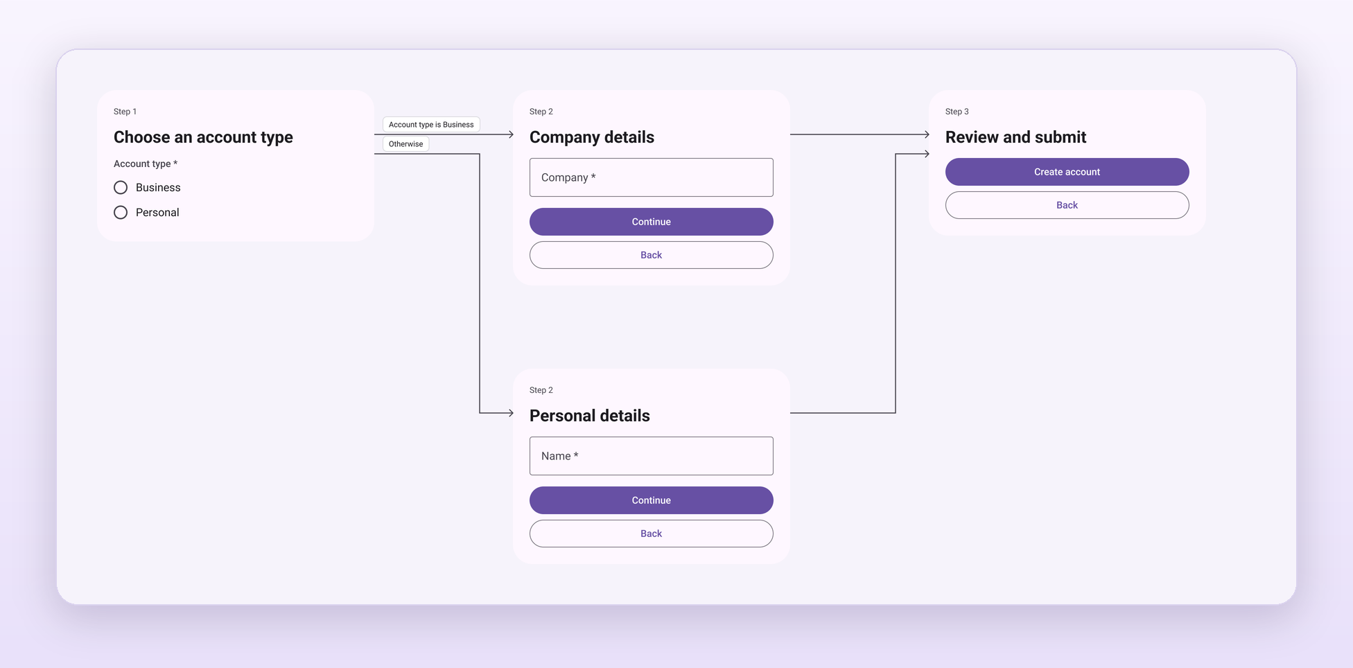
Update form keeps the positions of steps you moved, redraws the arrows and rewires the prototype.
Prototype
Every multi-step form is wired as a Figma prototype and added as a flow starting point, so Present opens it at the first step.
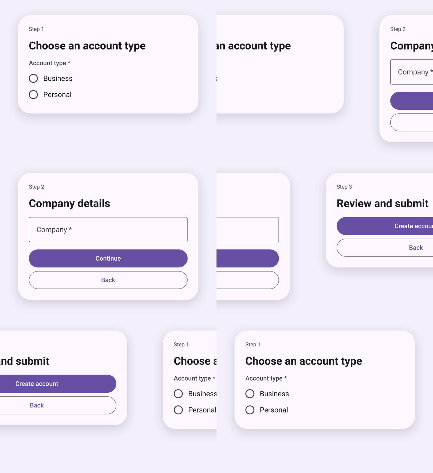
- Continue and Skip go to the step the routes pick when nothing is answered.
- Back goes back.
- Options of a radio that drives a route or advances on its own go to their next step.
One page
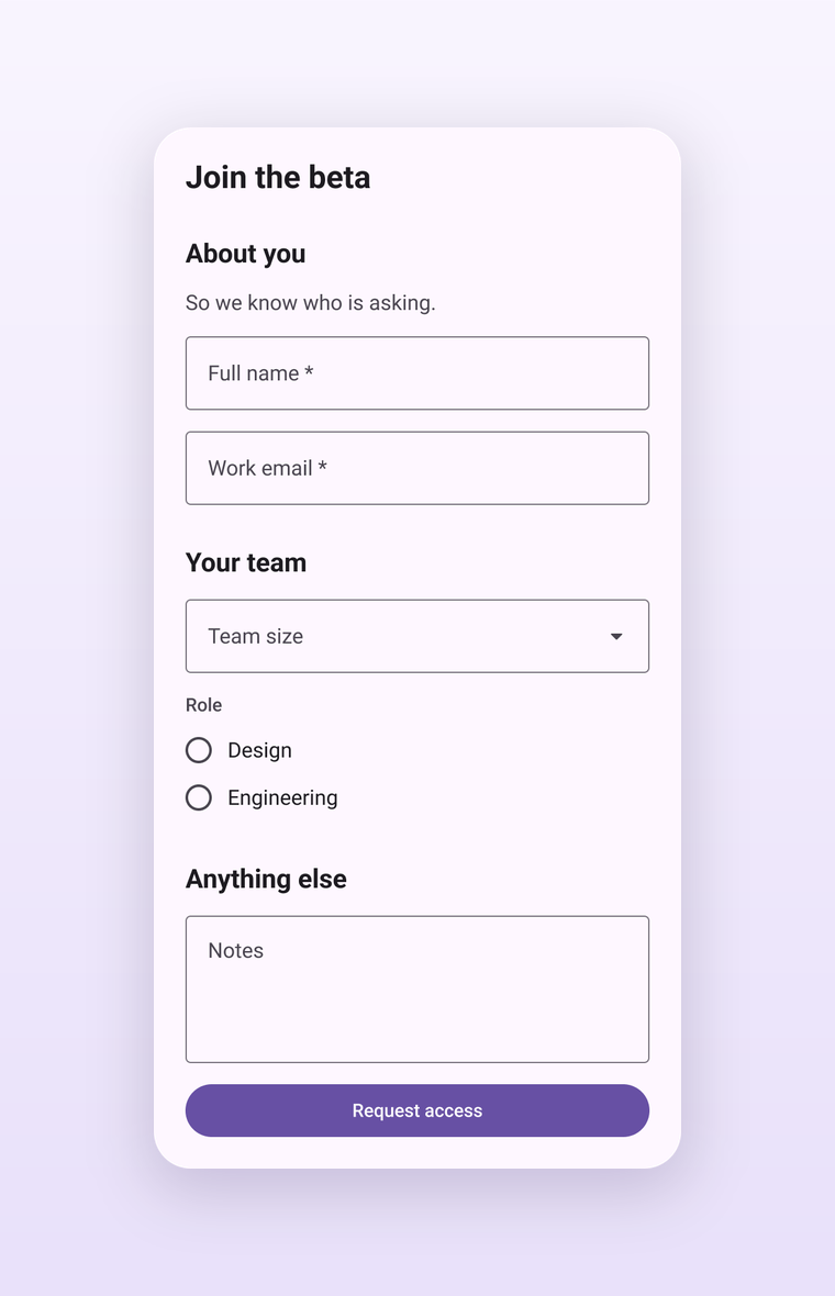
Steps at the top of the editor switches a multi-step form between separate screens and one page. One page draws every step as a titled section in a single frame with Submit at the end, without a flow map or prototype. Routes and step conditions stay in the definition, but every step is drawn.
Built-in kit
Pick Built-in kit under Components and choose Material 3 or iOS-like. On first use the plugin adds a Formhaus · <kit> section to the current page with one component per field role: text, select, textarea, date, file, checkbox, switch, radio and checkbox option rows, primary and secondary buttons. Forms are built from instances of these components, so restyling a kit component updates every generated form. The kit stays in the file and is reused on the next run.
Each kit component exposes Label, Value and Helper text properties and a Show helper toggle. Icons come from Material Symbols (Apache 2.0). Material 3 uses Roboto; iOS-like uses SF Pro when it is installed. Both fall back to Inter. Text inputs have Empty and Filled variants: Material shows only the label in an empty field, iOS-like shows the placeholder inside the cell.
My components
Open the Components tab to render forms with your own design system. Every field role has a card with a preview of the component it renders with, and the summary shows how many roles use your components, a related substitute or the built-in kit.
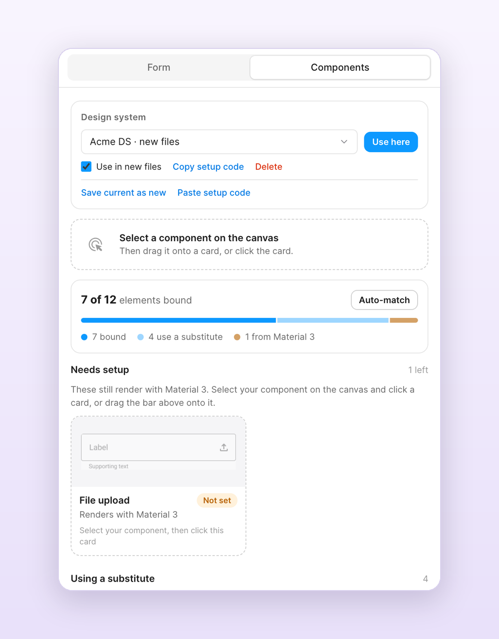
- Select a component, a component set or an instance on the canvas. The bar at the top shows it and suggests a role.
- Drag the bar onto a card, click the card, or click Bind as ….
- If the label, value or helper land in the wrong layers, open Text slots on the card and pick the right ones.
Binding an instance keeps its variant and boolean property values, so configure the instance the way fields should look before binding it. Library components are bound by key and imported when you generate. Auto-match binds unbound roles to components on the current page by name, such as Text field, Dropdown, Toggle or Button / Primary.
Roles you leave unbound reuse a related component when one is bound: a date or select field uses your dropdown or text field, a text area uses your text field, Back uses your text button. Without a text button, Skip and Cancel render as text in your primary button's font and colour. Anything else falls back to the selected built-in kit. With your own components the form card is neutral and takes its font and group label style from your text field.
Drag any card onto the canvas to place that component. Bindings are stored in the document, so everyone who opens the file generates with the same components.
Design systems
Save your bindings as a design system in the Design system card on the Components tab. Saved design systems are stored in your Figma account, so they are available in every file. Pick one and click Use here to bind it in the current file. Tick Use in new files to bind it automatically whenever you open the plugin in a file that has no setup yet.
Copy setup code gives a short code for teammates. They paste it with Paste setup code, and the design system is added to their account and used in their file. Library components work in any file that can access the library. Components that live in one file only work in other files after you publish them as a library.
Bind with Claude
Run /formhaus:formhaus-figma-connect to find your form components through the Figma MCP server, confirm them from screenshots and write the bindings into your file.
Earlier versions used a JSON component map. If you saved one, the plugin turns it into a design system called Saved component map, uses it in new files and binds it in the first file you open.
What the plugin generates
For each form, the plugin creates:
- A card frame per step, 400px wide with auto-layout, or one frame with a section per step in the one-page layout.
- Instances of the bound or kit components for every field, with labels, placeholders and helper text filled in.
- An actions group with the step's buttons.
- A flow map for forms with routes and a prototype for multi-step forms.
Built-in kits use their own card styling. With your own components the card is white and takes its font and group label style from your text field. Each frame stores the form definition, so you can select it later and edit it from the plugin.
Next steps
- /formhaus:formhaus-create-form: generate form definitions from text descriptions
- /formhaus:formhaus-figma-connect: bind components from your Figma library
- Field Types: all supported form field types
- Examples: example definitions to try with the plugin